The Weather Channel

More than utility

/ Timeline

Q4 2022 – Q1 2023

/ Squad

Customer Journey (Growth)

/ My Role

Acting design lead (product strategy • end-to-end design)

/ Platforms

iOS • Android

I led the redesign of Profile and Registration, transforming a utilitarian settings drawer into a hub for personalization and account management. By reframing registration as unlocking value such as cross-device consistency and a more relevant home feed, the redesign grew registered users from 500K to 6M and set the foundation for retention and engagement across 330M MAUs.

The redesigned app with streamlined navigation, customizable profile and onboarding, wellness hubs, and plan-ahead tools for trips, commutes, and daily routines.

/ challenge

How do you take a typically neglected corner of the app and turn it into an engine for activation and retention? That was the challenge issued in Q4 of 2022: show users why registration matters, and make it feel less like a toll booth and more like an invitation.

Legacy settings drawer showing account sign-up, premium trial, units, alerts, privacy, data rights, location, video autoplay, and support options.

legacy settings drawer

/ Atmosphere

By 2023, personalization had shifted from feature to baseline. People wanted their apps to know them, to anticipate without overwhelming, to feel made for them while still holding the keys to their own experience (Forbes 2023).

Users were even showing more willingness to pay for that kind of care. And with Google aiming to phase out third-party data in 2022 (but later abandoned), AI-driven personalization was quickly emerging as the future to growth (Twilio 2023).

The weather channel app prior to the redesign

/ From Signals to Structure

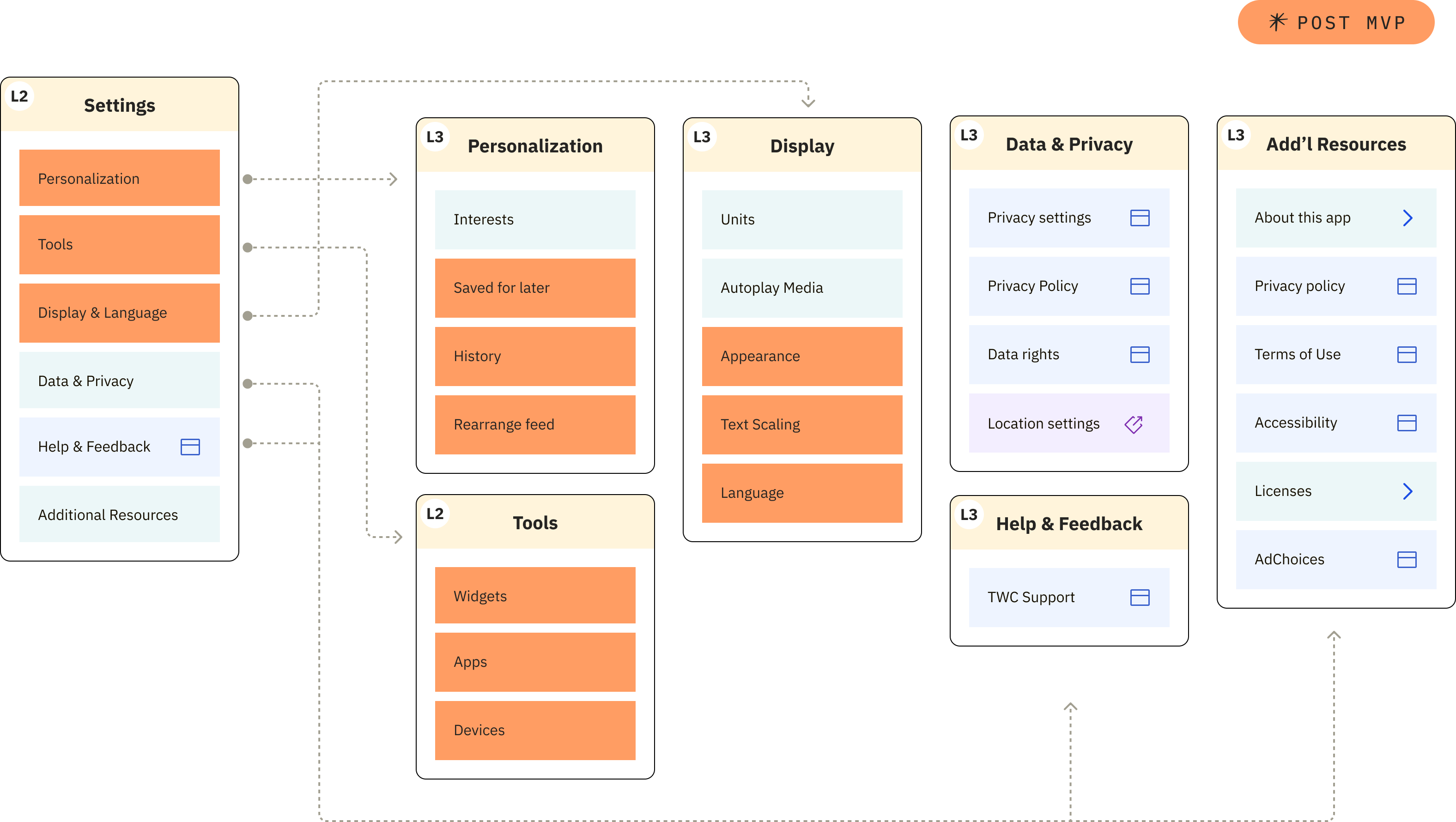
Market trends weren’t abstract concepts; they gave shape to the structural changes that followed. Renaming “Settings” to “Profile” was the first signal of that shift. But more broadly, Profile was reimagined as the hub where registration unlocked more: notifications, saved places, reordered feeds, and widget and interest management.

Early wireframe of the profile page showing account details, personalization setup, My TWC dashboard, and account settings.

But more broadly, Profile was reimagined as the hub where registration unlocked more: notifications, saved places, reordered feeds, and widget and interest management.

/ Beyond Launch

Profile was imagined as both an archive of choices and a scaffold for growth, a place where saving stories, following voices, and tailoring content could turn daily use into lasting connection.
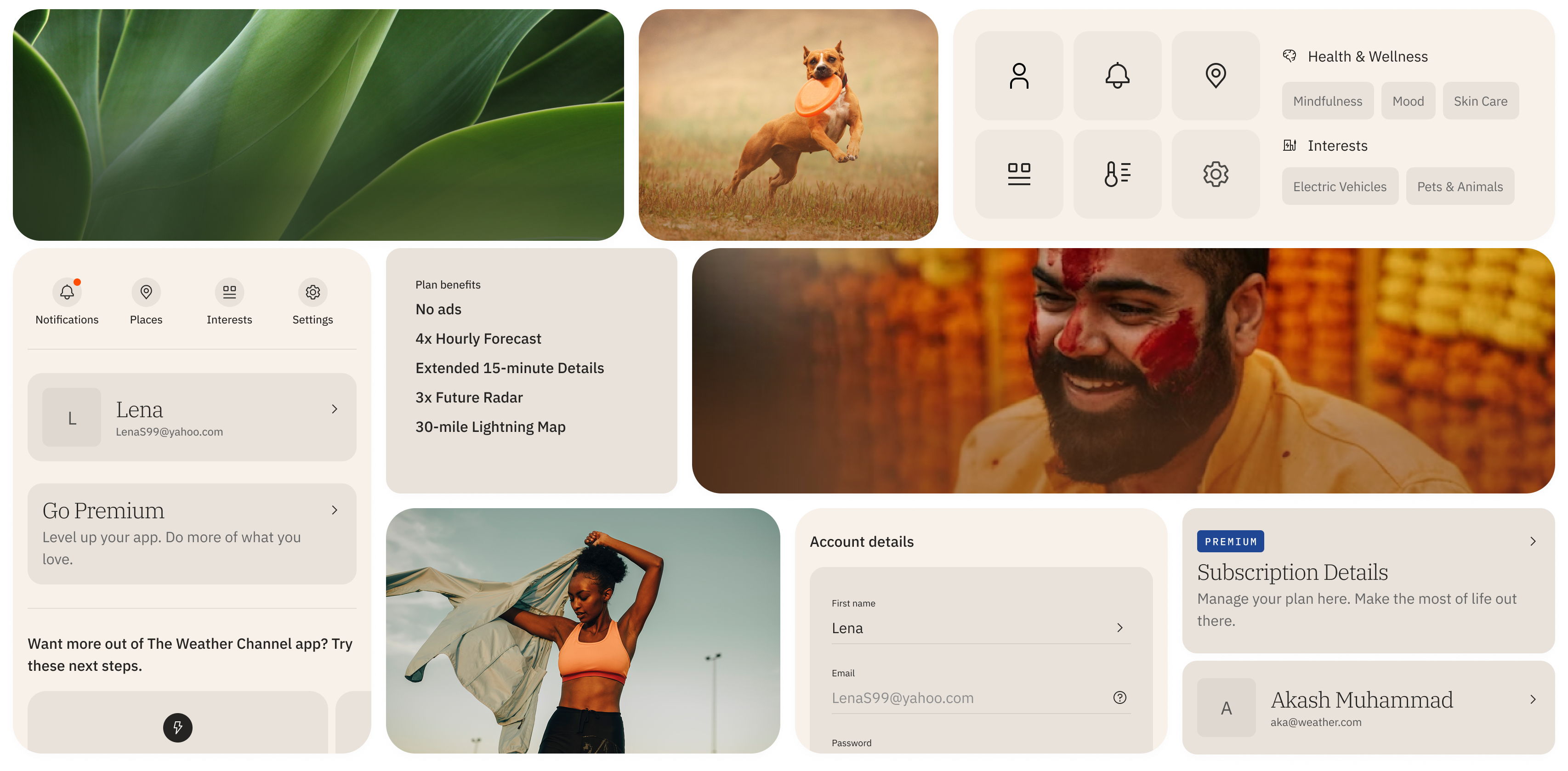
Assembly of images from branded imagery to UI elements as part of the permission priming aspect of the project

/ Making meaning together

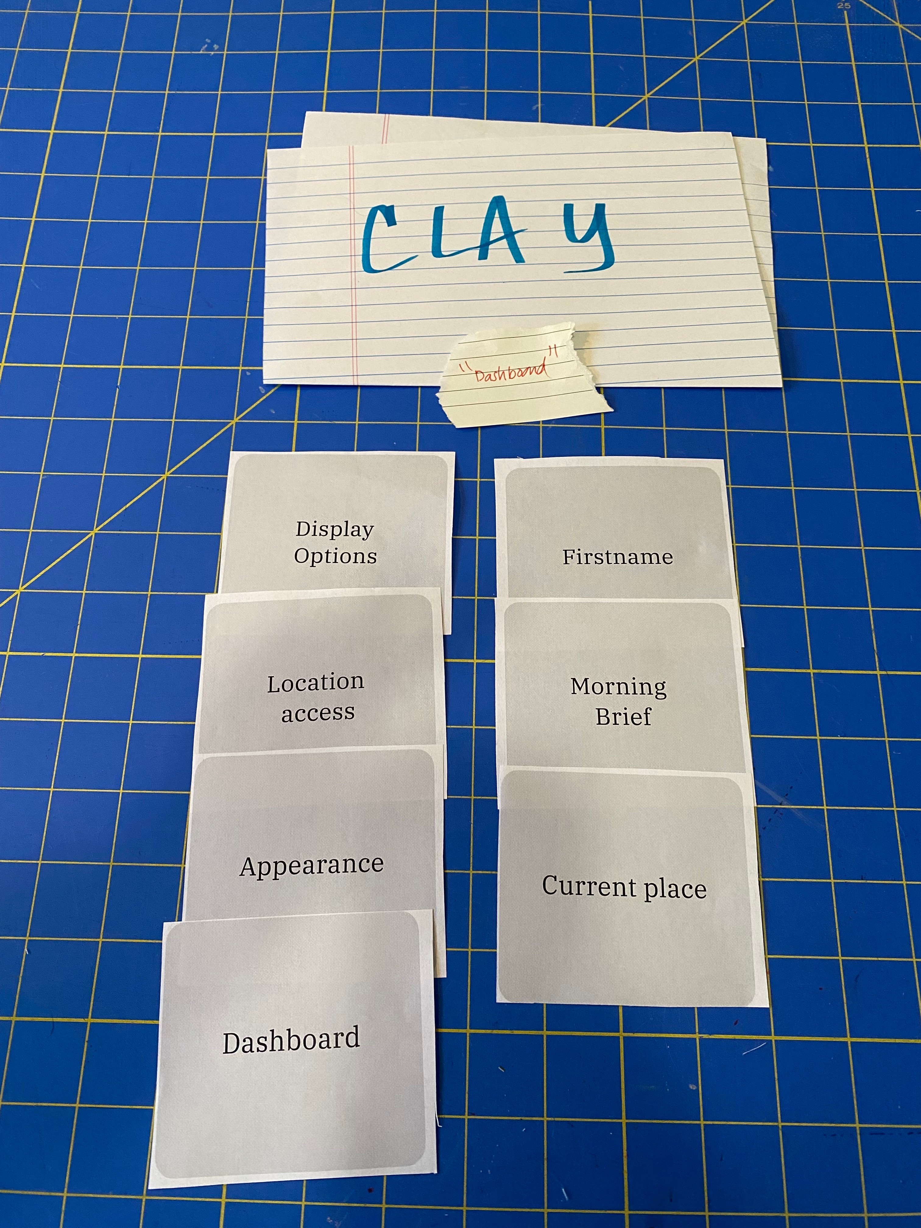
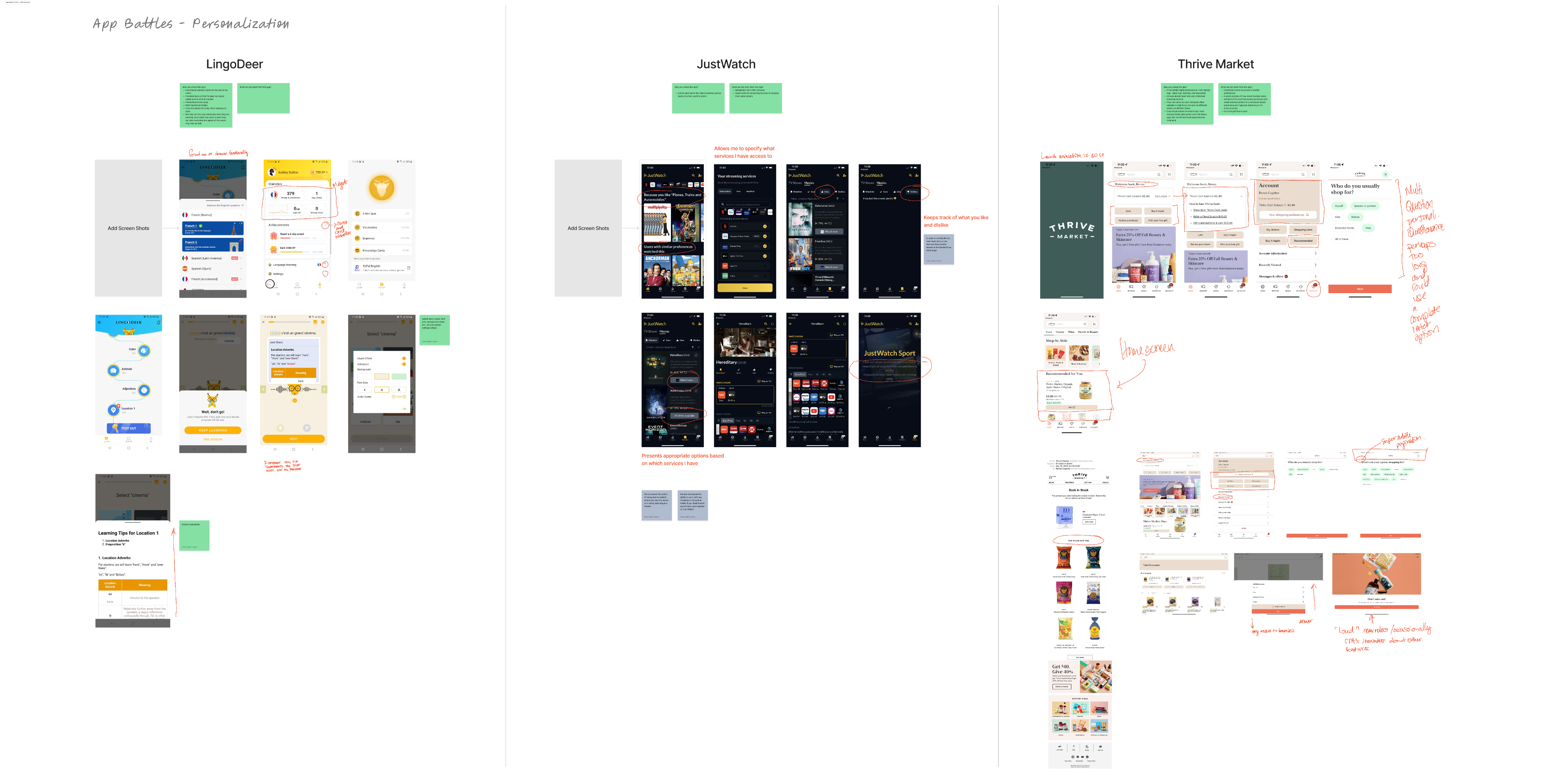
Card sorts and usability tests revealed what users needed most. To act on those findings, I hosted reviews, workshops, and playful “app battles” with product, engineering, and marketing to build alignment and keep conversion, subscriptions, and engagement central to our design decisions.

/ Research Insights (Card Sort)

75%

pushed legal and marketing items into “don’t care” buckets

2 Models

Younger users saw Profile as a dashboard. Older users saw Profile as account and subscription hub.

“Profile”

proved clearest, a single word that signaled belonging and made registration path legible

Tests showed users often didn’t know if they were anonymous, registered, or subscribed.

|

Making status explicit and reframing registration as unlocking continuity reduced friction and drove activation.

Card sorting revealed the need for alanced daily habits with deeper control.Card sorting revealed a preference for logical nesting of utilities in Settings, while also wanting quick access to high-frequency actions.

Quick Actions surfaced frequent tasks, while full settings remained. This created micro-engagement loops and encouraged return visits.

|

Early prototypes were overloaded, and not quite distinguishing accounts from subscriptions.

|

Streamlining clarified boundaries and gave the “Make It Yours” card stack room to teach features.

/ Impact

15%

registration conversion lift after app redesign

500K → 6M

registered users

+561%

registrations YoY across apps and web (1.8M → 12.3M)

/ Outcome
Profile became the hinge where anonymous use turned into commitment. It scaled registrations, clarified subscriptions, and set the foundation for personalization experiments that would drive retention.

The Weather Channel

More than utility

/ Timeline

Q4 2022 – Q1 2023

/ Squad

Customer Journey (Growth)

/ My Role

Acting design lead (product strategy • end-to-end design)

/ Platforms

iOS • Android

I led the redesign of Profile and Registration, transforming a utilitarian settings drawer into a hub for personalization and account management. By reframing registration as unlocking value such as cross-device consistency and a more relevant home feed, the redesign grew registered users from 500K to 6M and set the foundation for retention and engagement across 330M MAUs.

The redesigned app with streamlined navigation, customizable profile and onboarding, wellness hubs, and plan-ahead tools for trips, commutes, and daily routines.

/ challenge

How do you take a typically neglected corner of the app and turn it into an engine for activation and retention? That was the challenge issued in Q4 of 2022: show users why registration matters, and make it feel less like a toll booth and more like an invitation.

Legacy settings drawer showing account sign-up, premium trial, units, alerts, privacy, data rights, location, video autoplay, and support options.

legacy settings drawer

/ Atmosphere

By 2023, personalization had shifted from feature to baseline. People wanted their apps to know them, to anticipate without overwhelming, to feel made for them while still holding the keys to their own experience (Forbes 2023).

Users were even showing more willingness to pay for that kind of care. And with Google aiming to phase out third-party data in 2022 (but later abandoned), AI-driven personalization was quickly emerging as the future to growth (Twilio 2023).

The weather channel app prior to the redesign

/ From Signals to Structure

Market trends weren’t abstract concepts; they gave shape to the structural changes that followed. Renaming “Settings” to “Profile” was the first signal of that shift. But more broadly, Profile was reimagined as the hub where registration unlocked more: notifications, saved places, reordered feeds, and widget and interest management.

Early wireframe of the profile page showing account details, personalization setup, My TWC dashboard, and account settings.

But more broadly, Profile was reimagined as the hub where registration unlocked more: notifications, saved places, reordered feeds, and widget and interest management.

/ Beyond Launch

Profile was imagined as both an archive of choices and a scaffold for growth, a place where saving stories, following voices, and tailoring content could turn daily use into lasting connection.

Assembly of images from branded imagery to UI elements as part of the permission priming aspect of the project

/ Making meaning together

Card sorts and usability tests revealed what users needed most. To act on those findings, I hosted reviews, workshops, and playful “app battles” with product, engineering, and marketing to build alignment and keep conversion, subscriptions, and engagement central to our design decisions.

/ Research Insights (Card Sort)

75%

pushed legal and marketing items into “don’t care” buckets

2 Models

Younger users saw Profile as a dashboard. Older users saw Profile as account and subscription hub.

“Profile”

proved clearest, a single word that signaled belonging and made registration path legible

Tests showed users often didn’t know if they were anonymous, registered, or subscribed.

|

Making status explicit and reframing registration as unlocking continuity reduced friction and drove activation.

Card sorting revealed the need for alanced daily habits with deeper control.Card sorting revealed a preference for logical nesting of utilities in Settings, while also wanting quick access to high-frequency actions.

Quick Actions surfaced frequent tasks, while full settings remained. This created micro-engagement loops and encouraged return visits.

|

Early prototypes were overloaded, and not quite distinguishing accounts from subscriptions.

|

Streamlining clarified boundaries and gave the “Make It Yours” card stack room to teach features.

/ Impact

15%

registration conversion lift after app redesign

500K → 6M

registered users

+561%

registrations YoY across apps and web (1.8M → 12.3M)

/ Outcome
Profile became the hinge where anonymous use turned into commitment. It scaled registrations, clarified subscriptions, and set the foundation for personalization experiments that would drive retention.

The Weather Channel

More than utility

/ Timeline

Q4 2022 – Q1 2023

/ Squad

Customer Journey (Growth)

/ My Role

Acting design lead (product strategy • end-to-end design)

/ Platforms

iOS • Android

I led the redesign of Profile and Registration, transforming a utilitarian settings drawer into a hub for personalization and account management. By reframing registration as unlocking value such as cross-device consistency and a more relevant home feed, the redesign grew registered users from 500K to 6M and set the foundation for retention and engagement across 330M MAUs.

The redesigned app with streamlined navigation, customizable profile and onboarding, wellness hubs, and plan-ahead tools for trips, commutes, and daily routines.

/ challenge

How do you take a typically neglected corner of the app and turn it into an engine for activation and retention? That was the challenge issued in Q4 of 2022: show users why registration matters, and make it feel less like a toll booth and more like an invitation.

/ Atmosphere

By 2023, personalization had shifted from feature to baseline. People wanted their apps to know them, to anticipate without overwhelming, to feel made for them while still holding the keys to their own experience (Forbes 2023).

Users were even showing more willingness to pay for that kind of care. And with Google aiming to phase out third-party data in 2022 (but later abandoned), AI-driven personalization was quickly emerging as the future to growth (Twilio 2023).

Legacy settings drawer showing account sign-up, premium trial, units, alerts, privacy, data rights, location, video autoplay, and support options.

legacy settings drawer

The weather channel app prior to the redesign

/ From Signals to Structure

Market trends weren’t abstract concepts; they gave shape to the structural changes that followed. Renaming “Settings” to “Profile” was the first signal of that shift. But more broadly, Profile was reimagined as the hub where registration unlocked more: notifications, saved places, reordered feeds, and widget and interest management.

Early wireframe of the profile page showing account details, personalization setup, My TWC dashboard, and account settings.

But more broadly, Profile was reimagined as the hub where registration unlocked more: notifications, saved places, reordered feeds, and widget and interest management.

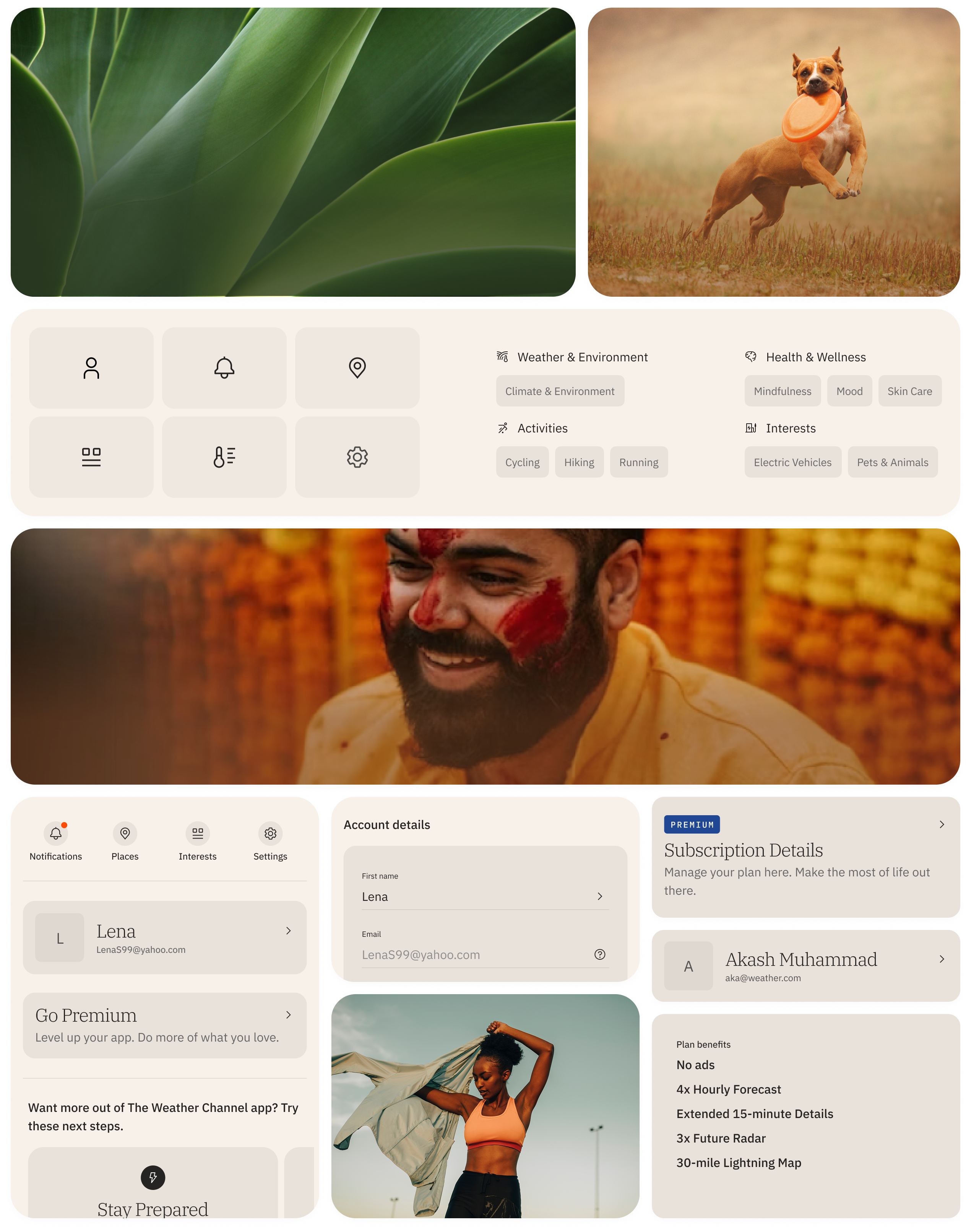
Assembly of images from branded imagery to UI elements as part of the profile, registration and personalization aspect of the redesign.

/ Beyond Launch

Profile was imagined as both an archive of choices and a scaffold for growth, a place where saving stories, following voices, and tailoring content could turn daily use into lasting connection.

Assembly of images from branded imagery to UI elements as part of the permission priming aspect of the project

/ Making meaning together

Card sorts and usability tests revealed what users needed most. To act on those findings, I hosted reviews, workshops, and playful “app battles” with product, engineering, and marketing to build alignment and keep conversion, subscriptions, and engagement central to our design decisions.

/ Research Insights (Card Sort)

75%

pushed legal and marketing items into “don’t care” buckets

2 Models

Younger users saw Profile as a dashboard. Older users saw Profile as account and subscription hub.

“Profile”

proved clearest, a single word that signaled belonging and made registration path legible

Tests showed users often didn’t know if they were anonymous, registered, or subscribed.

|

Making status explicit and reframing registration as unlocking continuity reduced friction and drove activation.

Card sorting revealed the need for alanced daily habits with deeper control.Card sorting revealed a preference for logical nesting of utilities in Settings, while also wanting quick access to high-frequency actions.

Quick Actions surfaced frequent tasks, while full settings remained. This created micro-engagement loops and encouraged return visits.

|

Early prototypes were overloaded, and not quite distinguishing accounts from subscriptions.

|

Streamlining clarified boundaries and gave the “Make It Yours” card stack room to teach features.

/ Impact

15%

registration conversion lift after app redesign

500K → 6M

registered users

+561%

registrations YoY across apps and web (1.8M → 12.3M)

/ Outcome
Profile became the hinge where anonymous use turned into commitment. It scaled registrations, clarified subscriptions, and set the foundation for personalization experiments that would drive retention.

The Weather Channel

More than utility

/ Timeline

Q4 2022 – Q1 2023

/ Squad

Customer Journey (Growth)

/ My Role

Acting design lead (product strategy • end-to-end design)

/ Platforms

iOS • Android

I led the redesign of Profile and Registration, transforming a utilitarian settings drawer into a hub for personalization and account management. By reframing registration as unlocking value such as cross-device consistency and a more relevant home feed, the redesign grew registered users from 500K to 6M and set the foundation for retention and engagement across 330M MAUs.

The redesigned app with streamlined navigation, customizable profile and onboarding, wellness hubs, and plan-ahead tools for trips, commutes, and daily routines.

/ challenge

How do you take a typically neglected corner of the app and turn it into an engine for activation and retention? That was the challenge issued in Q4 of 2022: show users why registration matters, and make it feel less like a toll booth and more like an invitation.

/ Atmosphere

By 2023, personalization had shifted from feature to baseline. People wanted their apps to know them, to anticipate without overwhelming, to feel made for them while still holding the keys to their own experience (Forbes 2023).

Users were even showing more willingness to pay for that kind of care. And with Google aiming to phase out third-party data in 2022 (but later abandoned), AI-driven personalization was quickly emerging as the future to growth (Twilio 2023).

Legacy settings drawer showing account sign-up, premium trial, units, alerts, privacy, data rights, location, video autoplay, and support options.

legacy settings drawer

The weather channel app prior to the redesign

/ From Signals to Structure

Market trends weren’t abstract concepts; they gave shape to the structural changes that followed. Renaming “Settings” to “Profile” was the first signal of that shift.

Early wireframe of the profile page showing account details, personalization setup, My TWC dashboard, and account settings.

But more broadly, Profile was reimagined as the hub where registration unlocked more: notifications, saved places, reordered feeds, and widget and interest management.

Assembly of images from branded imagery to UI elements as part of the profile, registration and personalization aspect of the redesign.

/ Beyond Launch

Profile was imagined as both an archive of choices and a scaffold for growth, a place where saving stories, following voices, and tailoring content could turn daily use into lasting connection.

Assembly of images from branded imagery to UI elements as part of the permission priming aspect of the project

/ Making meaning together

Card sorts and usability tests revealed what users needed most. To act on those findings, I hosted reviews, workshops, and playful “app battles” with product, engineering, and marketing to build alignment and keep conversion, subscriptions, and engagement central to our design decisions.

/ Research Insights (Card Sort)

75%

pushed legal and marketing items into “don’t care” buckets

2 Models

Younger users saw Profile as a dashboard. Older users saw Profile as account and subscription hub.

“Profile”

proved clearest, a single word that signaled belonging and made registration path legible

Tests showed users often didn’t know if they were anonymous, registered, or subscribed.

|

Making status explicit and reframing registration as unlocking continuity reduced friction and drove activation.

With everything at the first level, we learned that better balance between daily habits and deeper control was needed.

Quick Actions surfaced frequent tasks, while full settings remained. This created micro-engagement loops and encouraged return visits.

|

Early prototypes were overloaded, and not quite distinguishing accounts from subscriptions.

|

Streamlining clarified boundaries and gave the “Make It Yours” card stack room to teach features.

/ Impact

15%

registration conversion lift after app redesign

500K → 6M

registered users

+561%

registrations YoY across apps and web (1.8M → 12.3M)

/ Outcome
Profile became the hinge where anonymous use turned into commitment. It scaled registrations, clarified subscriptions, and set the foundation for personalization experiments that would drive retention.